SegmentUI 2.0 for Figma is now out, featuring mobile screens!
SegmentUI 2.0 for Figma is not out!
UI
Kit

Design
System
for

Figma
Consistent styles, components, screens & layouts for Figma
Trusted by 8,000+ freelancers & professionals from leading companies and top agencies


Bento Section

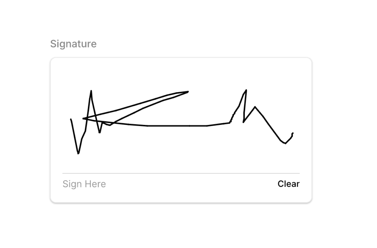
Input Field
Label
(optional)
*
https://

Prefix
Placeholder

Jane Doe

John Doe
+4 others
Input
Suffix
.com
hint text goes here
Label
(optional)
*
https://
Prefix
Placeholder
Jane Doe
John Doe
+4 others
Input
Suffix
.com
hint text goes here
Label
(optional)
*
https://
Prefix
Placeholder
Jane Doe
John Doe
+4 others
Input
Suffix
.com
error text goes here
Label
(optional)
*
https://
Prefix
Placeholder
Jane Doe
John
+4 others
Input
Suffix
.com
hint text goes here
Hero Section

Primary Button
Call to Action
Call to Action
Call to Action
Call to Action
Call to Action
Call to Action
Call to Action
Call to Action
Call to Action
Call to Action
Call to Action
Call to Action
Call to Action
Call to Action
Call to Action
Call to Action
Call to Action
Call to Action
Call to Action
Call to Action
Call to Action
Call to Action
Call to Action
Call to Action
Tab Group
Tab Item
Tab Item
Tab Item
Tab Item
Tab Item
Tab Item
Tab Item
Tab Item
Tab Item
Tab Item
Tab Item
Tab Item
Tab Item
Tab Item
Styled from the Ground Up
No need to spend time changing colors and styles manually. Our component & layouts are styled out of the box

Flexible Text Styles
Flexible text styles for consistent and scalable mobile, product, and web design.
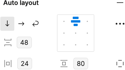
Variables & Auto-Layouts
Latest auto layout and variable updates for consistent, and responsive designs
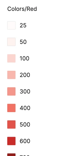
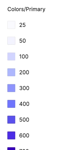
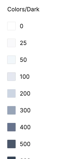
Dynamic Color Tokens
Components adapt using the LCH color model, offering a more realistic color set
Light, Warm & Dark Themed
Using Figma tokens, swap between light, warm and dark themes with ease


Unified Design System
One System for mobile, web apps, websites and Framer. Build consistent products and ship faster.

500+ Beautiful Mobile and Web Screens
Why chose one when you can have both. Design and develop in both Figma and Framer


The One Solution for Product and Web Design
Styles, sections & components for product design and web design.


Templates

Components


Sections


Mobile Screens


Templates
Components
Sections
Mobile Screens
Templates
Components
Sections
Mobile Screens
A Lifetime of Free Updates
Lifetime updates for a fixed one time payment. No subscriptions. No commitments
1
·
0
·
0
1
2
3
4
5
0
The Best of Both Worlds
Why chose one when you can have both. Design and develop in both Figma and Framer


A 360° Design Solution
Constantly updating, constantly evolving tools for Framer and Figma. Build more, design faster, sell more, charge more


Loved by Designers, Developers and Founders
See what our 8000+ customers have to say

Jorn van Dijk
@jornvandijk
Founder & CEO of Framer
"Some examples of things I love
….
https://segmentui.com"


Marc Andrew
@mrcndrw
Founder, Cabanna Design System
"This is a no-brainer. Nabeel is a master at his craft and someone who only builds products of extreme value to the end-user. 100% recommend."


Carlos G
@CarlosGeeronimo
Framer Designer
"Anyone who creates things with Framer should keep the SegmentUI kit in mind to improve their workflow!"

dudu
@Duduagency
Founder, ToolFolio
"@itsnotnabeel is adding Value to Segment UI Every. Single. Day. One of my favorite @framer Resources out there"


Ghostncrypt G
@ghostncrypt
Designer
"…SegmentUI has been one of the best value purchases I have made this year by far, with constant updates and a wide selection to choose from. “


Adheeb
@AdheebHameed
Design Engineer
"…Once you see some results, do not shy away from putting back into the business, it'll give you a better ROI than probably anywhere else in the world. I got tools that sped up my design, like @itsnotnabeel segment…"

dorian.pro
@doriandotpro
Framer Expert
"…I'm using @SegmentUI on 40-60% of my websites. As far as I know there's no better Framer boilerplate out there. And I'm not a55-kissing you, I'm happy I purchased the account. Cheers and kudos!"


Breeje Anadkat
@BreejeAnadkat
Product Designer
"...Segment UI by @itsnotnabeel is one of the best ones out there"

Alex Peña
@iialexp
Designer
"Yooo this thing saves so much time bro"

Danny Sapio
@Dannysapio
Founder, FramerOverrides, FramerAuth
"If you're a freelancer, agency, or just someone who makes a lot of Framer sites then this such a solid investment and time saver. Nabeel you crushed it on this one dude!"

Justin Farrugia
@justinmfarrugia
Designer
"…segment UI is my go to for pretty much every framer project nowadays..."

Widya Bayu W
@RalconStudio
Framer Designer
I’ve purchased the @SegmentUI Pro version yesterday, and I can say it’s been a real time-saver for my client projects!
SegmentUI is an advanced component library for Framer.
Since I don’t know how to code, I bought it to save time and work more efficiently.
Highly recommended!
I purchased it because my last two projects required custom code components that I couldn’t create myself, so I think it’s a great investment!

Isaac
@ikereyes1984
Graphic Designer
"i bought this and it’s such a good deal with the pro package
you get like 4 or 5 free quality templates with it too
i’m pretty sure he’s still adding more components to it too which makes its easy for template building 👍🏻"

Unlock everything with a one time payment
For the fraction of your next project, you can boost your workflow by 10 folds
Pro
$99
One Time Payment
Full Access to the Figma UI Kit
Full Access to the Framer UI Kit
Full Access to the Framer Code Components & CMS Upgrades
Full Access to Framer Plugins
Full Access to 4 Premium Framer Templates
StealthAI, BlockPool, DesignJungle, imagineAI worth $200+
Full Access to Framer Code Genie GPT
Request Components & Layouts
Get Updates Forever
Light, Dark & Dynamic Modes
Use for Unlimited Projects
Commercial License Only
Use for personal and client projects
Pro Creator
$199
One Time Payment
Everything in Pro
Template & Commercial License
Use UI Kit to create unlimited client projects and templates
Frequently Asked
For anything not covered here, mail us at hello@segmentui.com
General
What is SegmentUI?
Is it for Figma or Framer?
How do I access after purchasing?
License
Is atttribution required?
How does the licenses work?
Can I use it to create client projects?
Can I use it to create Framer templates?
Do my clients need to pay after I purchase?
Pricing
Is there a free version?
Do you have a student discount?
Will I get future updates if I purchase now?
Is this a one time payment or a subscription?
What is the difference between Pro and Pro Creator Access?


Supercharge Your Design Workflow
1000+ variations of styles, components, interactions, layouts, transforms, code overrides, code components for Framer & Figma. Power Up Now!


Links
Latest Framer Releases
Freebie Library
Latest Templates
CMS Upgrades
Directories
Figma Screens
Figma Components
Blog
A 360° Design Solution
Constantly updating, constantly evolving tools for Framer and Figma. Build more, design faster, sell more, charge more
Loved by Designers, Developers and Founders
See what our 8000+ customers have to say
Jorn van Dijk
@jornvandijk
Founder & CEO of Framer
"Some examples of things I love
….
https://segmentui.com"
Marc Andrew
@mrcndrw
Founder, Cabanna Design System
"This is a no-brainer. Nabeel is a master at his craft and someone who only builds products of extreme value to the end-user. 100% recommend."
Carlos G
@CarlosGeeronimo
Framer Designer
"Anyone who creates things with Framer should keep the SegmentUI kit in mind to improve their workflow!"
dudu
@Duduagency
Founder, ToolFolio
"@itsnotnabeel is adding Value to Segment UI Every. Single. Day. One of my favorite @framer Resources out there"
Adheeb
@AdheebHameed
Design Engineer
"…Once you see some results, do not shy away from putting back into the business, it'll give you a better ROI than probably anywhere else in the world. I got tools that sped up my design, like @itsnotnabeel segment…"
dorian.pro
@doriandotpro
Framer Expert
"…I'm using @SegmentUI on 40-60% of my websites. As far as I know there's no better Framer boilerplate out there. And I'm not a55-kissing you, I'm happy I purchased the account. Cheers and kudos!"
Breeje Anadkat
@BreejeAnadkat
Product Designer
"...Segment UI by @itsnotnabeel is one of the best ones out there"
Alex Peña
@iialexp
Designer
"Yooo this thing saves so much time bro"
Danny Sapio
@Dannysapio
Founder, FramerOverrides, FramerAuth
"If you're a freelancer, agency, or just someone who makes a lot of Framer sites then this such a solid investment and time saver. Nabeel you crushed it on this one dude!"
Widya Bayu W
@RalconStudio
Framer Designer
I’ve purchased the @SegmentUI Pro version yesterday, and I can say it’s been a real time-saver for my client projects!
SegmentUI is an advanced component library for Framer.
Since I don’t know how to code, I bought it to save time and work more efficiently.
Highly recommended!
I purchased it because my last two projects required custom code components that I couldn’t create myself, so I think it’s a great investment!
Isaac
@ikereyes1984
Graphic Designer
"i bought this and it’s such a good deal with the pro package
you get like 4 or 5 free quality templates with it too
i’m pretty sure he’s still adding more components to it too which makes its easy for template building 👍🏻"
Unlock everything with a one time payment
For the fraction of your next project, you can boost your workflow by 10 folds
Pro
$99
One Time Payment
Full Access to the Figma UI Kit
Full Access to the Framer UI Kit
Full Access to the Framer Code Components & CMS Upgrades
Full Access to Framer Plugins
Full Access to 4 Premium Framer Templates
StealthAI, BlockPool, DesignJungle, imagineAI worth $200+
Full Access to Framer Code Genie GPT
Request Components & Layouts
Get Updates Forever
Light, Dark & Dynamic Modes
Use for Unlimited Projects
Commercial License Only
Use for personal and client projects
Pro Creator
$199
One Time Payment
Everything in Pro
Template & Commercial License
Use UI Kit to create unlimited client projects and templates
Frequently Asked
For anything not covered here, mail us at hello@segmentui.com
General
What is SegmentUI?
Is it for Figma or Framer?
How do I access after purchasing?
License
Is atttribution required?
How does the licenses work?
Can I use it to create client projects?
Can I use it to create Framer templates?
Do my clients need to pay after I purchase?
Pricing
Is there a free version?
Do you have a student discount?
Will I get future updates if I purchase now?
Is this a one time payment or a subscription?
What is the difference between Pro and Pro Creator Access?
Supercharge Your Design Workflow
1000+ variations of styles, components, interactions, layouts, transforms, code overrides, code components for Framer & Figma. Power Up Now!
Links
Latest Framer Releases
Freebie Library
Latest Templates
CMS Upgrades
Directories
Figma Screens
Figma Components
Blog

